

The data may be a lot, but Excel's Correl function helps you eliminate noise. Calculating the correlation coefficient is a secret weapon to find a hidden trend and make a smarter decision.
What is Correl function in Excel?
Correl is a statistical function in Excel used to measure the relationship between two data sets. This function calculates the correlation coefficient – one value from -1 to 1 indicates that the level of linear relationship between the two variables. The following is the syntax of the Correl function in Excel:
=CORREL(array1, array2)Array1 and Array2 are the two data range you want to analyze.
The correlation coefficient 1 means perfect positive correlation, while -1 indicates the perfect negative correlation. Value 0 indicates that there is no linear relationship. This way, Correl helps you quantify the intensity and direction of these relationships in your data.
How to use Correl function in Excel
Now, you understand what function of Correl performs and how to prepare your data, let's take a look at an example to see how the Correl function works.
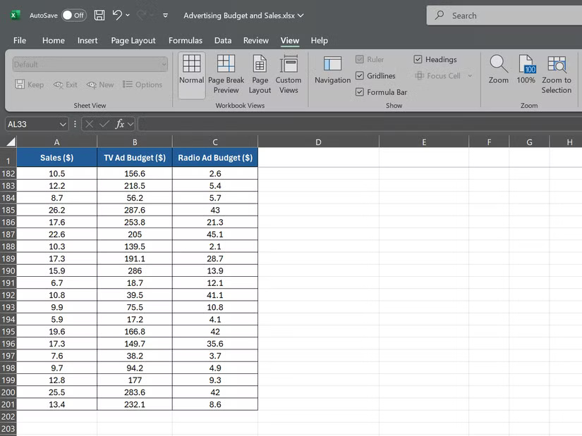
Suppose you are a sales manager who is analyzing the data of the previous year. You have 3 data sets: Monthly sales, advertising spending on TV and advertising spending on radio, each episode has 200 data points.
To calculate the correlation between sales revenue and advertising spending on TV, choose an empty and imported box:
=CORREL(A2:A201, B2:B201)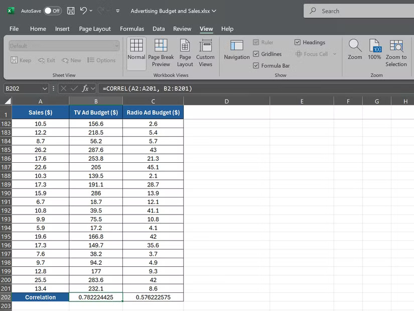
This formula requires Excel to calculate the correlation between sales data in A2: A201 and advertising spending data on TV in B2: B201. Next, to calculate the correlation between sales revenue and advertising spending on the radio, use the following formula:
=CORREL(A2:A201, C2:C201)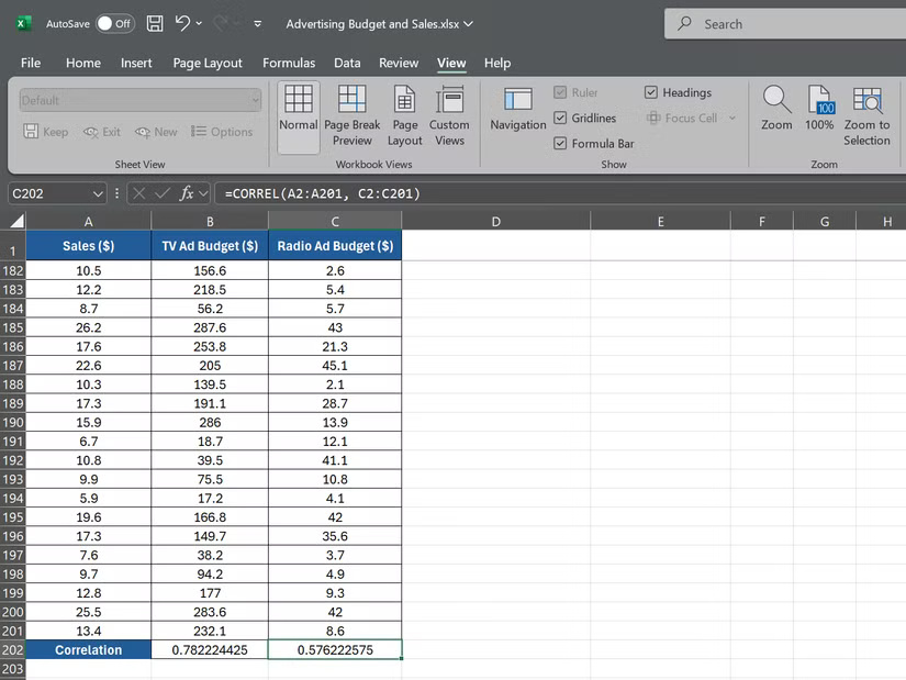
This formula will give you the correlation coefficient between sales data in A2: A201 and advertising spending on the radio in C2: C201.
Assuming the first formula returns the correlation coefficient of 0.78, shows a strong correlation between advertising spending on TV and sales. The second formula returns the correlation coefficient of 0.576, showing that the positive correlation is weaker between the advertising spending on the radio and the sales revenue.
Combining Correl function with other Excel tools
The Correl function is a powerful tool, but when combined with other excel features, it becomes even stronger. The two main tools that can improve your correlation analysis are PivotTables and Xlminer Analysis Toolpak.
PivotTables in Excel allows you to summarize and analyze large data sets quickly. Using PivotTable, you can easily calculate the correlation between variables and detect trends in multiple dimensions.
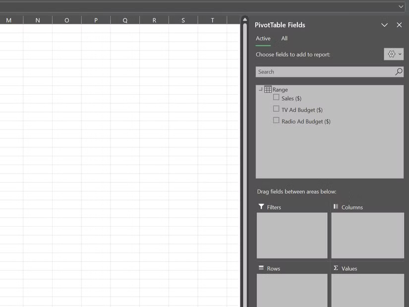
For example, suppose you have a small -sized sales data by area and product portfolio; You can use PivotTable to calculate the correlation between sales and different factors such as price, advertising spending or demographic information of customers for each combination of the region and the category.
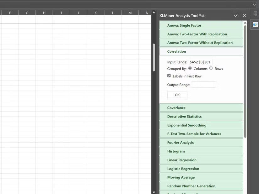
Xlminer Analysis Toolpak is an add-in providing advanced statistical functions, including correlation. While the Correl function calculates the correlation between the two variables, the Correlation tool in Xlminer Analysis Toolpak can calculate the correlation for the entire data set in just once.
The Correl function is a powerful tool to analyze the relationships in data, helping you gain a deeper understanding. However, if you want to analyze your data over time, the trend function in Excel is another great tool to explore.
